
Table of Contents
TogglePlanning family beach photos often feels like coordinating a military operation, between sunscreen, sandy toddlers, and finding the right time of day, outfit coordination can slip down the priority list. But here’s the thing: color schemes make or break beach photography. The right palette transforms snapshots into frame-worthy portraits, while the wrong one creates visual chaos that even the best photographer can’t fix. This guide cuts through the Pinterest noise to give homeowners and DIY photo planners practical, tested beach family photo color schemes that work with sand, surf, and that golden hour light everyone’s chasing.
Key Takeaways
- Color schemes make or break beach photography—the right palette transforms snapshots into frame-worthy portraits while the wrong one creates visual chaos that poor lighting can’t fix.
- Successful family beach photo color schemes use a three-to-four color maximum with coordinated neutrals, complementary tones, and varied textures rather than matching uniforms.
- Nautical blues and whites, sunset-inspired warm tones, and earthy neutrals with bold accents are proven beach photo color schemes that work across different lighting conditions and skin tones.
- Choose your beach photo color scheme based on your specific location’s palette—white sand allows nearly any color, tan sand requires contrast, and rocky beaches benefit from earthy tones and neutrals.
- Plan outfits two weeks ahead using paint chips and fabric swatches to test combinations in natural light, prioritize fit and comfort over aesthetics, and assign one person as the final color coordinator to ensure cohesion.
Why Color Coordination Matters for Beach Photography
Beach environments create unique photography challenges that don’t exist in studio or backyard settings. The sand reflects light upward, creating fill light that can wash out pale colors or make poorly chosen hues look sickly. Water adds blues and greens to the ambient light, which shifts skin tones and fabric colors in ways most people don’t anticipate until they see the proofs.
Coordinated color schemes solve three specific problems. First, they create visual hierarchy, the eye knows where to look instead of bouncing between competing bright patterns. Second, they complement rather than fight the natural beach palette of blues, tans, and whites. Third, they photograph consistently across different lighting conditions, from harsh midday sun to soft sunrise glow.
Think of color coordination like choosing trim paint for a room. You wouldn’t paint baseboards electric lime if your walls are sage green. The same principle applies to family outfits against a beach backdrop. The goal isn’t matching uniforms, it’s a cohesive palette where individual pieces work together without screaming for attention.
Most failed beach photos share one trait: too many competing colors. When Grandma wears neon pink, Dad’s in a graphic tee, and the kids sport cartoon characters, the beach itself disappears. The location becomes irrelevant. A three-to-four color maximum keeps focus on faces and setting, not wardrobe chaos.
Classic Coastal Color Schemes That Always Work
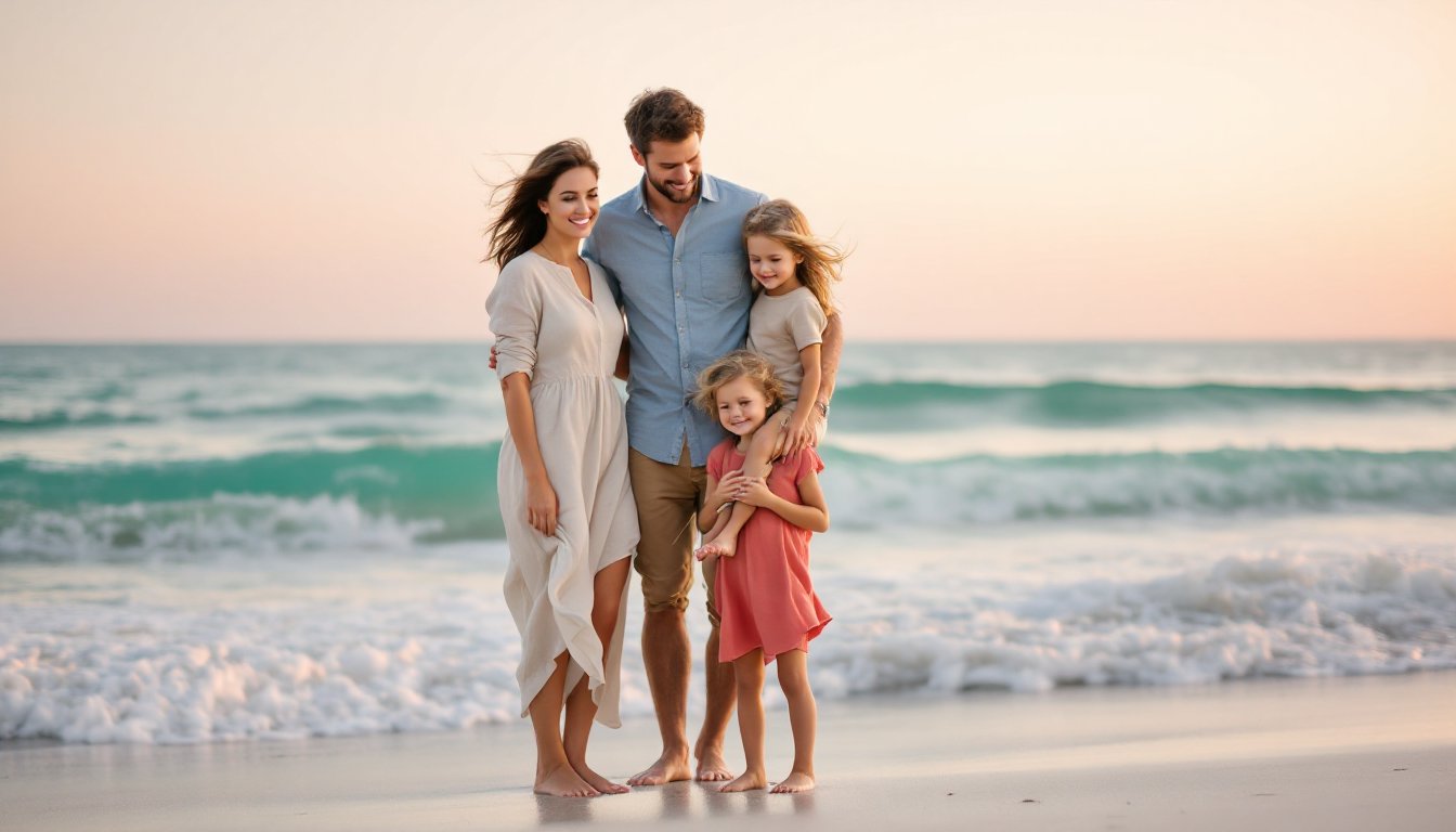
Nautical Blues and Whites
This combination works because it mirrors the beach environment, white sand, blue water, blue sky. The familiarity creates harmony instead of contrast. For execution, use navy, light blue, and crisp white as your three-color base. Add one accent like soft tan or coral for visual interest.
Fabric choice matters here. Avoid pure white cotton tees, which photograph flat and show every wrinkle. Instead, opt for cream, ivory, or oatmeal for whites, they add dimension and won’t blow out in bright sun. For blues, vary the saturation. One person in navy chinos, another in a chambray shirt, a third in a powder blue dress creates depth without looking like a uniform catalog.
Denim works in this scheme but requires thought. Dark-wash jeans photograph almost black in certain light and create heavy visual weight at the bottom of frames. If someone’s wearing jeans, pair them with a lighter top to balance. Better yet, consider khaki or tan pants that keep the breezy coastal vibe.
Accessories tie this together. Straw hats, rope bracelets, or tan leather sandals reinforce the nautical theme without requiring matching outfits. Just skip the anchor-print everything, subtle beats literal.
Sunset-Inspired Warm Tones
Warm palettes photograph beautifully during golden hour (the hour before sunset) when light takes on amber and pink tones. Build around coral, peach, warm taupe, and soft gold. This scheme particularly flatters diverse skin tones, adding warmth without the coolness that blues can introduce.
The key is keeping tones muted rather than saturated. Think terracotta, not traffic-cone orange. Dusty rose, not hot pink. These softer hues complement rather than compete with sunset light. When planning outfits, designer paint color inspiration often provides better palettes than fashion sites, interior designers understand how colors interact in natural light.
Layering matters in warm schemes. A cream base layer with a coral cardigan or scarf adds dimension that flat single-color outfits lack. For guys, a tan or stone-colored henley under an unbuttoned coral or rust short-sleeve shirt works without looking too coordinated.
Avoid mixing warm and cool tones in this palette. One person in peachy tones and another in lavender creates discord. Stick to one temperature family for cohesion.
Modern and Trendy Beach Photo Palettes
Current trends favor earthy neutrals with one bold accent. Think sand, taupe, olive, and cream with a single pop of terracotta or dusty blue. This approach looks contemporary without dating photos five years from now, a consideration for images that’ll hang in the living room.
Another modern direction: monochromatic neutrals in varying textures. All creams and tans work when you mix linen, cotton, and chambray fabrics. The texture variation creates visual interest that solid blocks of color can’t achieve. This scheme particularly suits families who want a minimalist, gallery-wall aesthetic.
For families willing to take risks, jewel tones against neutrals create striking images. One person in emerald green or sapphire blue, everyone else in cream and tan. This works best for smaller families (three to four people) where the bold color doesn’t overwhelm the frame.
Avoid trendy patterns, buffalo check, leopard print, or geometric designs, unless you’re comfortable with photos looking dated in a few years. If someone insists on pattern, make it one person maximum, and keep it subtle (thin stripes, small florals).
How to Choose Colors That Complement Your Beach Setting
Not all beaches photograph the same. White sand beaches like Florida’s Gulf Coast demand different color strategies than rocky New England shores or volcanic black sand in Hawaii. Start by analyzing your specific location’s color palette.
White sand beaches: Nearly any color scheme works, but avoid pure white clothing that disappears into the sand. Blues, corals, and earth tones all pop against white sand. This is your most forgiving environment.
Tan or beige sand: Skip khaki and beige clothing that blends into the background. Instead, choose colors with contrast, navy, coral, dusty blue, or even black for bold, editorial-style shots.
Rocky or driftwood-heavy beaches: Embrace neutrals and earth tones that harmonize with the weathered wood and stone. Greens, grays, and browns create cohesive images. For ideas on natural color coordination, home design publications often feature palettes inspired by coastal landscapes.
Tropical settings with vegetation: Work with the greens rather than against them. Coral, peach, and warm neutrals complement tropical foliage. Avoid wearing green unless you want to blend into palm trees.
Time of day affects color choices too. Harsh midday sun washes out pastels and makes dark colors photograph nearly black. Golden hour flatters nearly everything but especially enhances warm tones. Overcast days provide even light that handles a wider color range, including jewel tones that might overpower sunny images.
Consider the water color. Caribbean turquoise requires different planning than Pacific gray-blue. Generally, water provides your natural color anchor, choose outfit colors that complement rather than match it exactly.
Planning Your Family’s Outfits: Practical Tips and Mistakes to Avoid
Start planning two weeks before the shoot, not the night before. This gives time to acquire missing pieces, test outfit combinations in natural light, and make adjustments. Lay everything out together like staging a room renovation, what looks good in separate closets might clash when assembled.
Create a color board using paint chips, fabric swatches, or a digital mockup. This reference keeps everyone aligned and prevents last-minute “I thought you said teal, not turquoise” confusion. Many regional design guides feature coastal color palettes that translate well to clothing choices.
Address fit and comfort early. Clothing that’s too tight, too loose, or requires constant adjustment shows in photos. Everyone should move, sit, and squat in their outfits beforehand. For kids especially, prioritize comfort over cuteness, a cranky toddler in a scratchy dress ruins more shots than mismatched colors.
Common mistakes to avoid:
• Overly busy patterns: Stripes, plaids, and logos distract from faces. Solid colors or very subtle prints work best.
• Too matchy-matchy: Identical outfits look forced. Coordinated beats matching every time.
• Ignoring shoes: Sandals and bare feet photograph fine, but scuffed sneakers or mismatched footwear draws the eye downward. If wearing shoes, make them neutral.
• Last-minute shopping: Rushed purchases lead to poor fits and limited color choices. Plan ahead.
• Forgetting undergarments: White shirts require proper undergarments. Visible bra straps or undershirts show in photos.
• Skipping the test run: Put everything on together at home in natural light. Take phone photos. What works indoors might fail outdoors.
For execution day, pack a backup outfit per person in your coordinated colors. Kids spill, adults sweat, and sand gets everywhere. Having options prevents panic and wasted photographer time.
Bring safety pins, a lint roller, and stain remover wipes. Beach photos involve sitting on sand, climbing rocks, and chasing waves. Small wardrobe malfunctions happen, prepare like you would for a renovation project where the unexpected is expected.
Finally, assign one person as color coordinator who has final approval on all outfit choices. Too many opinions create compromise palettes that satisfy no one. One decision-maker, whether it’s the person booking the photographer or the family’s designated style expert, streamlines the process and ensures cohesive results.